Product Designer & AI-Assisted PWA Builder
Cambridge Field Tracker
An offline-first research operations PWA for Cambridge fieldwork
Operational internal tool
Turned a manual fieldwork coordination problem into an offline-capable PWA that helped track physical survey distribution across a dataset of 597 Cambridge food businesses.
Visit cambridge-field-log.lovable.app- Role
- Product Designer & AI-Assisted PWA Builder
- Dataset
- 597 Cambridge food businesses
- Surface
- Offline-capable PWA
- Context
- Smart Food Cities, Anglia Ruskin University
01
Context
I was working as a Research Assistant on the Smart Food Cities project at Anglia Ruskin University. The research team needed to physically distribute adverts and invitations for an essential survey to food businesses across Cambridge.
The work involved visiting businesses, leaving materials, recording what happened at each visit, returning to businesses when asked, and keeping a sense of overall progress across the campaign.
The operational problem appeared during delivery of the research itself. There was no practical way to see which businesses had already been visited, what happened at each visit, which ones still needed a return or follow-up, and how much of the Cambridge dataset had been covered.
02
Product problem
This was not a generic CRM problem. It was a field-operations problem, and the research workflow needed a tool built around how the work is actually done on the street.
- Support a known dataset of 597 Cambridge food businesses.
- Let a field researcher find a business quickly by name, street or postcode.
- Record a delivery outcome immediately, at the door.
- Distinguish pending, delivered, refused, return, closed and follow-up states.
- Reduce duplicate visits and forgotten follow-ups.
- Support navigation and directions while moving between businesses.
- Show progress across the whole fieldwork campaign.
- Remain useful when mobile connectivity was unreliable.
03
Users & stakeholders
The product had a narrow, well-understood user base — which made it possible to design for the session rather than for a persona.
- Primary — research assistant or field researcher carrying out the physical distribution.
- Primary — research team members reviewing campaign progress.
- Stakeholder — the Smart Food Cities research team and Anglia Ruskin University researchers.
- Stakeholder — Cambridge food businesses receiving the survey advert or invitation.
- Job to be done“When I am on the street, I need to know which business I should visit next so I do not waste time.”
- Job to be done“When I finish a visit, I need to record the outcome immediately so the team does not lose the information.”
- Job to be done“When a business asks me to return later, I need that to remain visible rather than disappear into notes.”
- Job to be done“When the team reviews progress, we need to know what is done, what is pending and what requires follow-up.”
04
Discovery & problem identification
This was firsthand discovery rather than hypothetical user research. I was one of the people doing the field activity, so I experienced the coordination gap directly rather than hearing about it second-hand.
I designed the product around the actual sequence of work: what you need to know before leaving, what you need at the door, and what has to be captured before you walk to the next address.
- 01Start with Cambridge food-business dataset
- 02Search or select next business
- 03Travel to location
- 04Attempt delivery
- 05Record outcome immediately
- 06Route to next business or schedule return
- 07Review daily and campaign progress
05
Designing for fieldwork
Almost every meaningful decision in this product came from the physical conditions of the work rather than from a feature wish list.
Mobile use while walking
The tool is used standing outside a shopfront or moving between them, often one-handed. Layout, tap targets and reading order were designed for that posture, not for a desk.
Intermittent connectivity
Signal drops inside buildings and on certain streets. The app had to remain fully usable without a connection rather than failing at the moment of capture.
597 businesses
A dataset this size stops being scrollable. Search and filtering are the primary navigation, not secondary conveniences.
Rapid updates after each visit
If recording an outcome is slower than remembering it, it will be remembered instead — and then lost. Updating had to cost a tap or two.
Multiple possible outcomes
A visit is not complete or incomplete. It can be delivered, refused, closed, deferred to a return, or flagged for follow-up, and each carries a different next action.
Avoiding duplicate visits
Revisiting an address that was already covered wastes the scarcest resource in the campaign — walking time — and strains the relationship with the business.
Directions without becoming a map product
Researchers needed to get to an address, not a mapping engine. Navigation is handed off to the tool the researcher already trusts on their phone.
Data must survive the session
Records have to remain understandable to the research team after the field session ends, which shaped how outcomes and notes are structured.
06
Key product decisions
Each decision below is paired with the reasoning behind it, because in an internal tool the rationale is the product.
Decision 1
Offline-capable PWA
Rationale — Fieldwork should not depend on stable mobile data. The app needed to remain usable while researchers moved around Cambridge, with no install friction on whatever phone they carried.
Decision 2
Search by business, street or postcode
Rationale — A researcher might remember the business name, the road they are standing on, or only the postcode. Retrieval had to match how people actually navigate in the field.
Decision 3
Explicit status model
Rationale — Pending, Delivered, Refused, Return, Closed and Follow-up. A binary complete/not-complete state loses operational meaning — 'return later' requires a different future action from 'refused' or 'closed'.
Decision 4
One-tap, low-friction field actions
Rationale — The cost of updating must be lower than the cost of writing a note or relying on memory, otherwise the tool simply will not be used consistently.
Decision 5
Directions from each business record
Rationale — Reduce switching between the dataset and a separate manual address lookup, while using external navigation instead of building a complex mapping engine into the MVP.
Decision 6
Progress dashboard
Rationale — The team needed a campaign-level view, not just a list of records. Progress percentage and status counts make the remaining workload visible.
Decision 7
Filters by status
Rationale — Researchers should be able to answer operational questions quickly: show me everything still pending, what needs a return, which businesses refused.
Pending
In the dataset, not yet attempted.
Visit — this is the working queue.
Delivered
Materials left with the business.
None — counts towards coverage.
Refused
Business declined to take part.
None — closes the record honestly.
Return
Nobody available, or asked to come back.
Revisit — stays in the active workload.
Closed
Premises closed or no longer trading.
Remove from workload, keep for reporting.
Follow-up
Contact promised or requested beyond the visit.
Non-field action by the research team.
07
MVP & product scope
Distribution was already underway, so the first version had to be genuinely useful immediately. I drew a hard boundary around what the first version had to do and what it deliberately did not need to do.
In the first version
- The 597-business Cambridge dataset
- Search by name, street and postcode
- Business record cards with address, postcode and category
- Directions hand-off to the device's maps app
- Status update actions at the point of visit
- Status filters
- Progress summary and dashboard
- Offline-capable behaviour
- Notes and feedback where supported by the product
Deliberately not required
- Full route-optimisation engine
- Custom turn-by-turn navigation
- Complex CRM features
- Public-facing accounts
- Analytics beyond fieldwork progress
Orientation
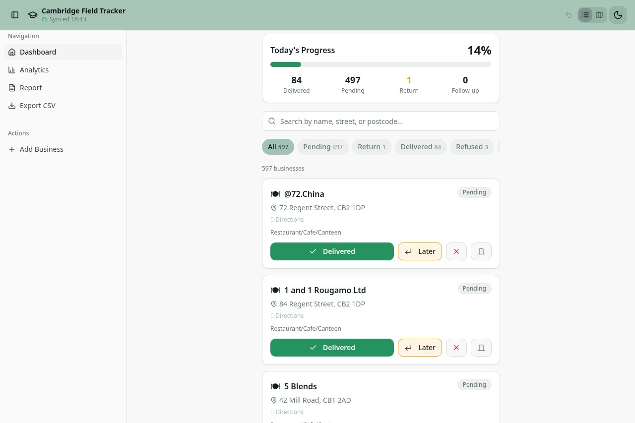
Today's Progress card
Opens on the campaign state: progress percentage with delivered, pending, return and follow-up counts, so the session starts with orientation rather than a list.
Navigation
Search and status filter chips
A single search field over name, street and postcode, with filter chips that narrow the list to one operational question at a time.
Records
Business cards
Each record shows business name, address, category and a Directions link — the four things needed to decide and to arrive.
Capture
Rapid actions
Actions such as Delivered and Later/Return sit on the card itself, so recording an outcome does not require opening a detail screen.
08
How I built it
I identified the workflow problem through the research work itself, defined the field states, search behaviour, progress model and interaction flow, then used Lovable to accelerate implementation.
I tested the product against the actual 597-business field dataset and iterated around how the tool needed to work during physical visits.
AI accelerated implementation; it did not replace product ownership. The problem framing, status model, scope boundary and field testing were mine, and the corrections that mattered most were the ones that came from using the tool while walking.
09
Technical product view
Described conceptually — this is the product architecture as I designed it, with implementation specifics flagged where they still need confirming against the current codebase.
Progressive web application
Installable from the browser with no app-store step, which mattered because the tool had to be adopted mid-campaign.
Mobile-first field interface
Layout, contrast and tap targets designed for outdoor, one-handed use rather than scaled down from a desktop view.
Offline-capable, local-first behaviour
The dataset and status changes are available and writable on the device without a connection.
Structured business dataset
597 records carrying name, address, postcode and category as the fields the field workflow depends on.
Search and filtering layer
Matching across name, street and postcode, combined with status filtering as the main way through the list.
Status model per business
Each record holds one current state from a fixed six-value set, which is what makes progress aggregation meaningful.
Progress aggregation
Counts and completion percentage derived from the same records the field worker updates, so reporting is never a separate spreadsheet.
Directions deep-linking
Each record links out to the device's native navigation app rather than embedding a map.
Sync and persistence mechanism
To verifyExact storage and reconciliation implementation to verify against the current codebase before stating it publicly.
10
Validation & outcomes
The evidence here is qualitative and operational. I am deliberately not claiming quantitative outcomes I have not yet measured.
- The tool originated from a real research-delivery problem, not a portfolio exercise.
- It was built for a live Cambridge fieldwork dataset of 597 food businesses.
- The workflow and statuses reflect delivery outcomes actually encountered or anticipated during field activity.
- It provided a single place to see campaign progress and the state of individual businesses.
11
Product management competencies
What this project demanded of me as a product person, rather than what the product contains.
- Firsthand problem discovery
- Internal-tools product thinking
- Workflow mapping
- Jobs-to-be-done framing
- Mobile UX
- Offline-first product thinking
- State-machine and status modelling
- Scope control
- MVP definition
- Operational analytics
- User-centred prioritisation
- Rapid delivery and iteration
12
Evidence gallery
Captured from the live product. These are real screens, not reconstructions.
Live product capture
Progress, search, status filters and the 597-business list
Captured from the running product.
cambridge-field-log.lovable.app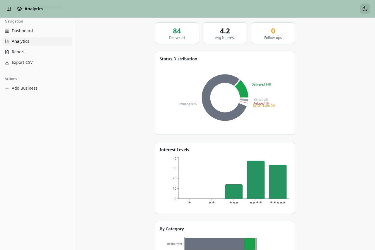
Live product capture
Analytics — status distribution, interest levels and category split
Captured from the running product.
cambridge-field-log.lovable.app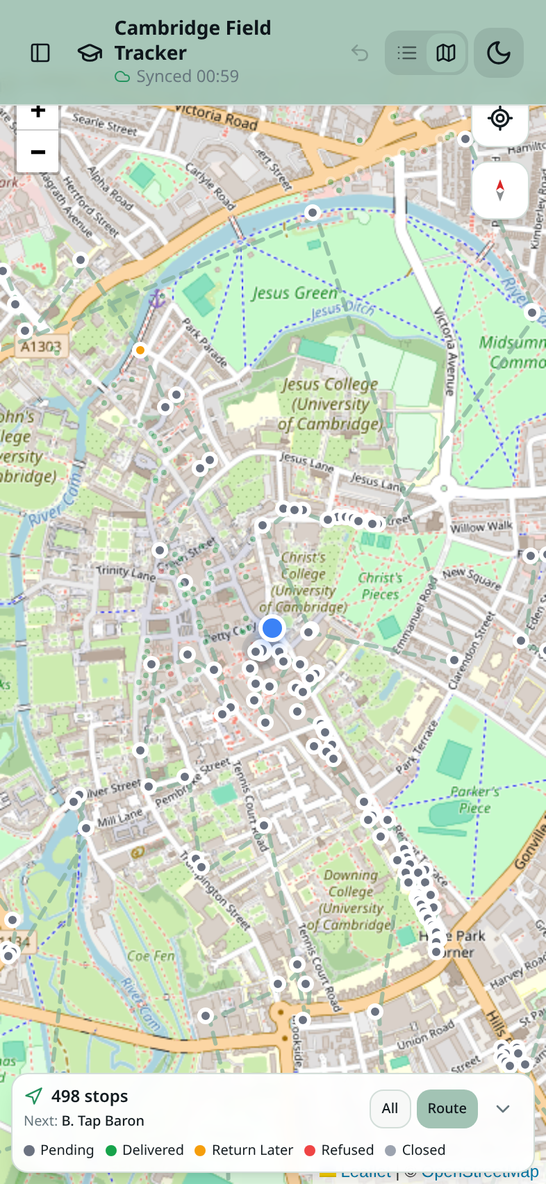
Live product capture
Mobile map view — 498 stops, live position and status legend
Captured from the running product on a phone.
cambridge-field-log.lovable.app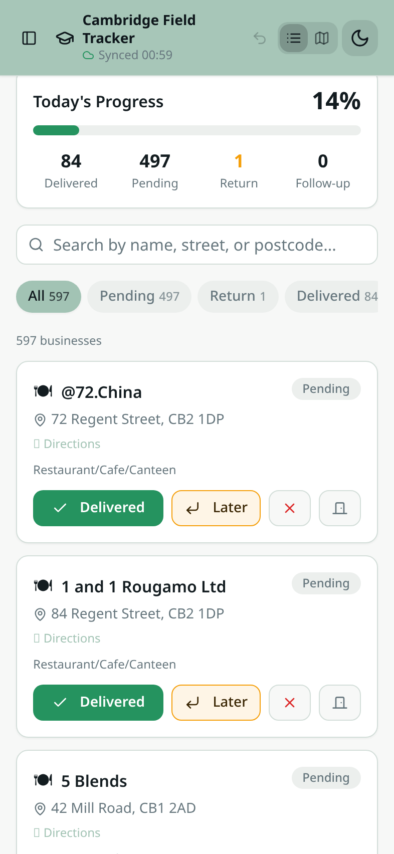
Live product capture
Mobile list view — today's progress, search and one-tap status actions
Captured from the running product on a phone.
cambridge-field-log.lovable.app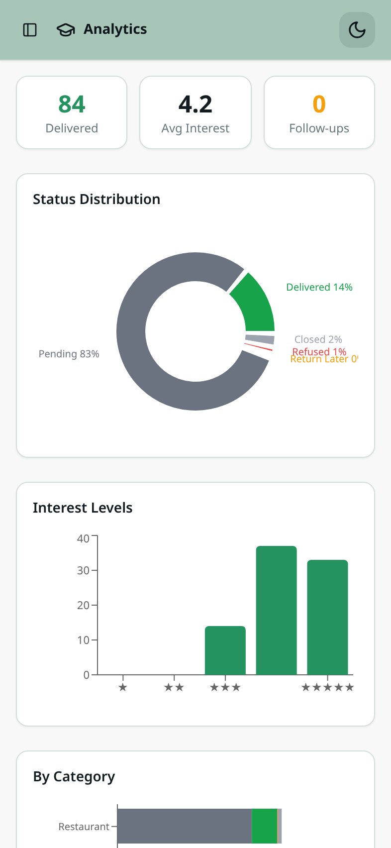
Live product capture
Mobile analytics — delivered count, status distribution and interest levels
Captured from the running product on a phone.
cambridge-field-log.lovable.app
Measurement & evidence planThe measures being put in place so outcomes can be reported with confidence rather than estimated.10 items
- Number of researchers who used the tool
- Number of field sessions
- Number of businesses ultimately visited
- Counts by outcome: delivered, refused, return, closed, follow-up
- Duplicate visits avoided
- Time to locate and update a business record
- Before/after comparison of the fieldwork process
- Research-team testimonial
- Screenshots captured during actual field use
- Product analytics and offline-sync logs, if available
13
What I learned
Internal tools create value by reducing cognitive load and closing coordination gaps, not by having lots of features.
Status design matters because each status implies a different next action. 'Return' and 'refused' are not variations of the same thing.
Offline capability is a product requirement, not a technical nicety, when the environment makes connectivity uncertain.
When you are also the user, firsthand insight is powerful — but it still has to be separated from assumptions about other users.
The best MVP was not route optimisation. It was making field state visible and reliable first.
14
What I would do next
The natural next phase is moving from a single-researcher field aid to a coordinated, measurable team tool.
Structured follow-up dates and reminders
Turn 'return later' from a status into a scheduled action so nothing depends on memory.
Assigned researcher per business
Ownership per record so a team can split the dataset without two people walking the same street.
Route clustering
Lightweight geographic grouping of pending businesses — short of full route optimisation, which remains out of scope.
Richer notes and outcome reasons
Capture why a business refused or deferred, which is research signal rather than admin.
Campaign history and audit trail
Time-stamped visit history per business instead of latest-status-only.
Multi-user sync and collaboration
Shared campaign state across researchers, including conflict behaviour when two devices reconnect.
Export and reporting
Coverage and outcome exports usable directly in research analysis and write-up.
Field analytics instrumentation
Average visits per session, completion rate and time-to-update, so the next version can be judged on evidence.
Usability testing with other researchers
Validate the interface with people who did not design it, and who did not walk the original route.